
Portfolio (Scribd.com):
Project Corrections / Time spent: I spent an hour fixing my logos and creating all new ones instead. I spent about half an hour working on fixing my brochure. I spent 20 minutes fixing my Photoshop project. I also spent ten minutes fixing my stationary.
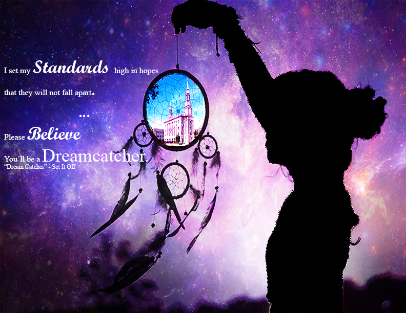
Message: The message for this portfolio is that I have high interest in music and have created many projects though inspiration of music.
Audience: People interested in music and future employers.
Top Thing Learned: The biggest thing I learn is how much I have enjoyed this class and how I know the things I have learned will help me in my future.
Future application of Visual Media: I want to work in the music industry though sometimes I am unsure where, I used music to inspire a lot of the projects in my portfolio.
Color scheme and color names: Brick (Monochromatic)
Title Font Name & Category: Sakkal Majalla (San Serif)
Copy Font Name & Category: Mistral (Script)
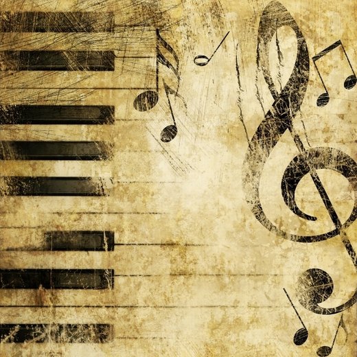
Thumbnails of Images used:


Sources (Links to images on original websites / with title of site):
- http://moshlab.com/wp-content/uploads/2015/04/Frame-Texture-Black-Wallpaper-HD-For-Desktop-Mobile-456299384845.jpg
- http://wallpaperbeta.com/wallpaper_gray/gray_treble_clef_piano_music_textures_style_hd-wallpaper-332417.jpg
- http://images.24ur.com/media/images/520xX/Feb2009/60248652.jpg?b254
- http://4.bp.blogspot.com/-tB-yPtbV6Tg/Twn4DOwonGI/AAAAAAAAB1w/LkkHic3LM60/s1600/Heavy_Metal.jpg


